Basic content
You must be logged to see this page.
This is the heart of your page/post layout.
Between the page header and the page footer, you can basically do anything with your layout. There are many possibilities.
A section is a layout block. They are displayed one above the other, between the header and the footer of the page/post. You can :

This is the main layout block. It is used to display text, images, video on one or two column. They are many option to customize your content : background color, background image, padding, etc.
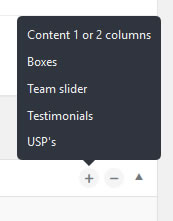
First step first : you choose a layout.
The wysiwyg editor(s) will appear/disappear according to your choice:
Start by choosing a “Section background”
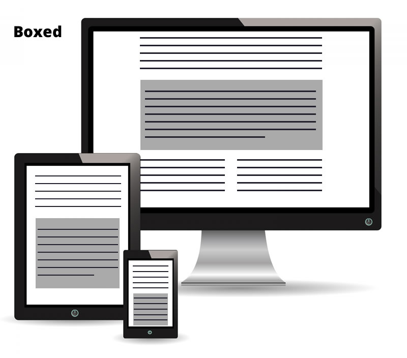
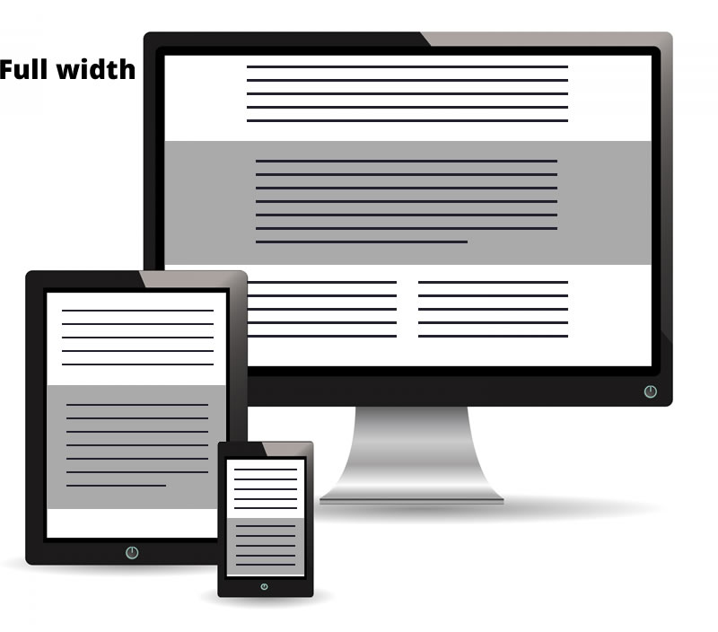
Finally, choose the “Size of the section background“.
Note : on small screen size (tablet, smartphone) this will render nearly the same as the screen width is almost the content width. In responsive mode, the “boxed” size will leave a small blank space on the left and on the right. The “full width” size won’t leave blank space.
You can set :
The “boxes” are a way to present the content into boxes, displayed side by side.
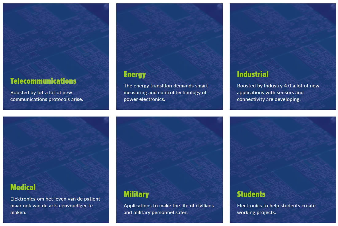
First you chose how many boxes you want side by side, by choosing a number in the Number of columns dropdown.
Note : on smaller screen like smartphone, the number of boxes by row will be automatically reduced in order to fit the screen width
Then you click on Add a box to add a boxes.
You complete the fields :
Like other section block, you can set your background and paddings. See above for more details (chapter “Content 1 or 2 Column > Background tab or Option tab).
Will display a slider with the team member.

There is nothing to set here. Indeed, all the team member published in the “Team” menu (see on the left) will be displayed and ordered according their order number.
The number of member side by side is
You can still set a background and paddings in the dedicated tabs.
Will display a slider with the testimonials.
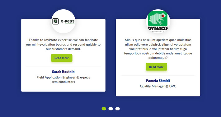
There is nothing to set here. Indeed, all the testimonials published in the “Testimonial” menu (see on the left) will be displayed, by the most recent first.
The number of testimonial side by side is
You can still set a background and paddings in the dedicated tabs.
Will display the USP’s side by side.
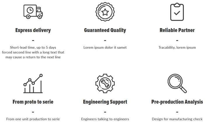
All the USP’s published in the “Options” menu (see on the left) will be displayed, in the order set in the menu.
You can set
Very short lead times
Industrial grade quality
From proto to serie
Engineering support
User-friendly platform
Strong partnerships
Member of


🔧 Platform upgrade in progress – Stay connected!
We are currently upgrading the myProto platform to serve you even better. In the meantime, feel free to email us your project files (BOM, Gerber, Centroid, Lead Time & quantities) directly at 👉 quotation@myproto.eu.
We’ll be delighted to provide you with a quote as quickly as possible!
You can of course still use the current version of the platform if you prefer.


